Insider
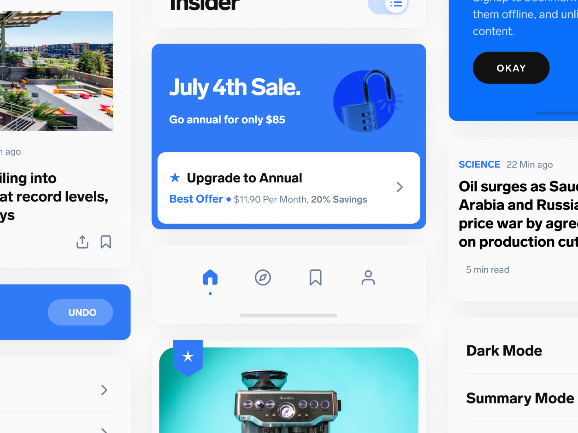
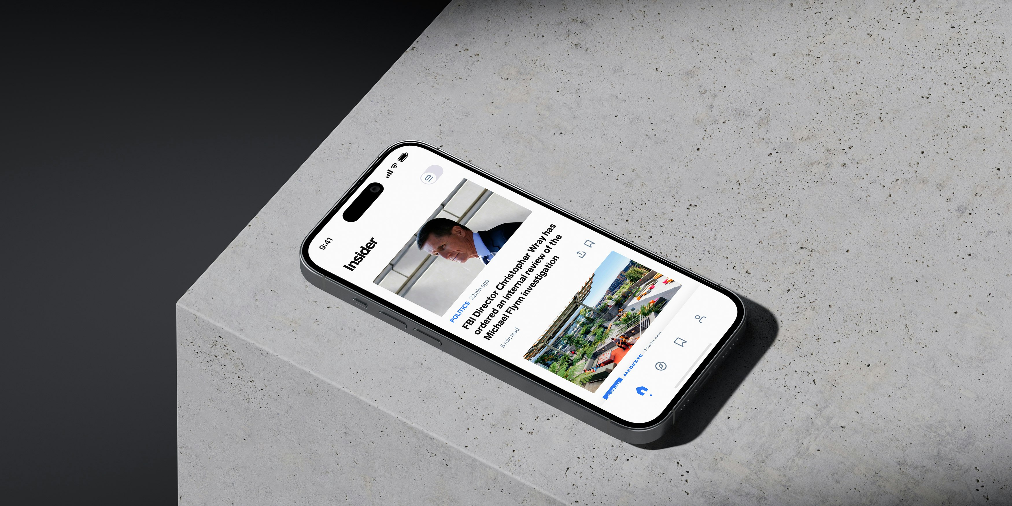
Mobile AppBusiness Insider approached MetaLab for a full redesign of their mobile app, following their rebranding to Insider.
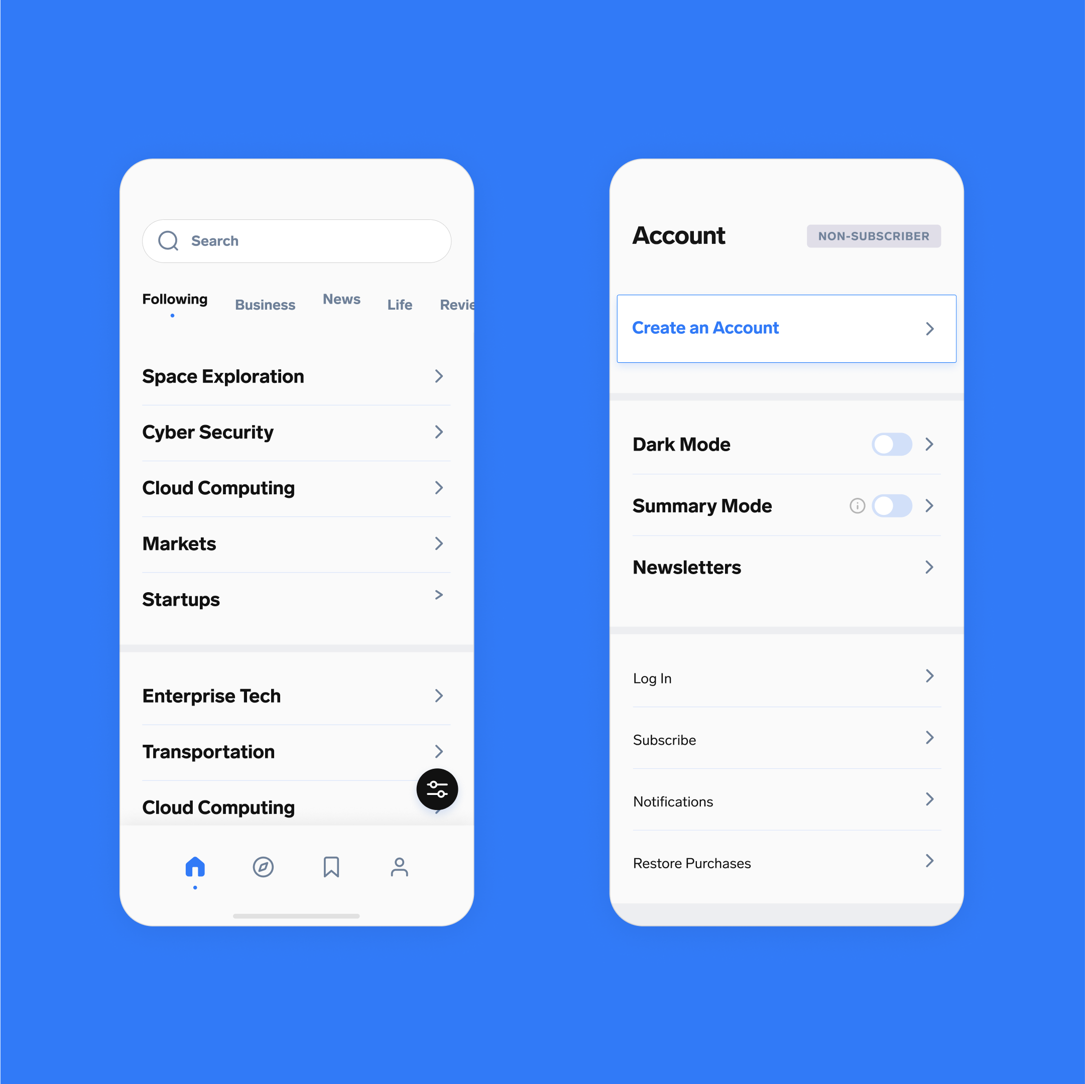
Nowadays, they cover a broad range of topics ranging from business to news to life and in order to better represent their diverse coverage and stay current, they needed a fresh and solid design that would represent their new identity.
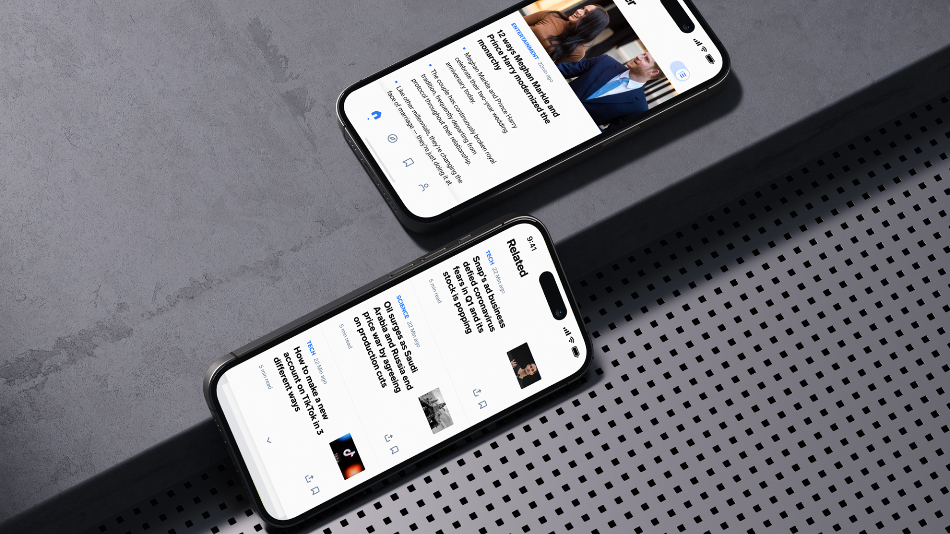
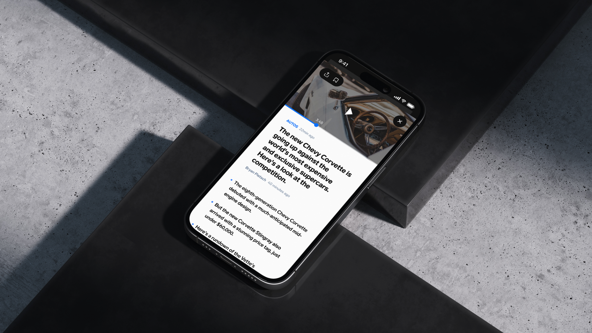
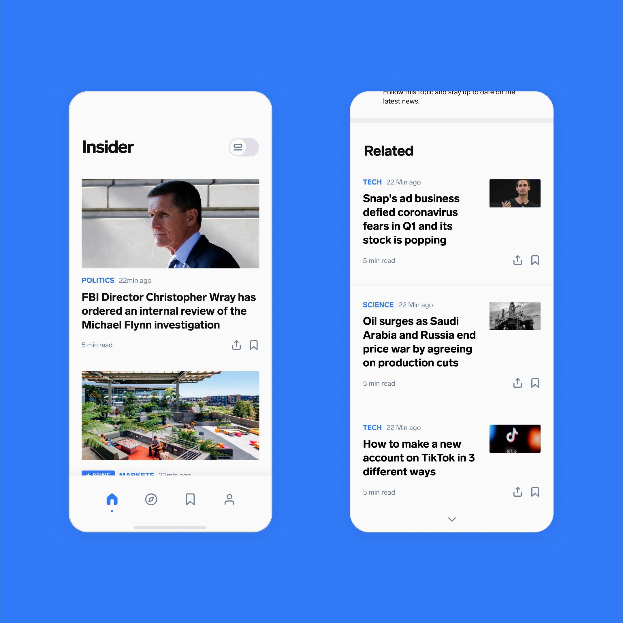
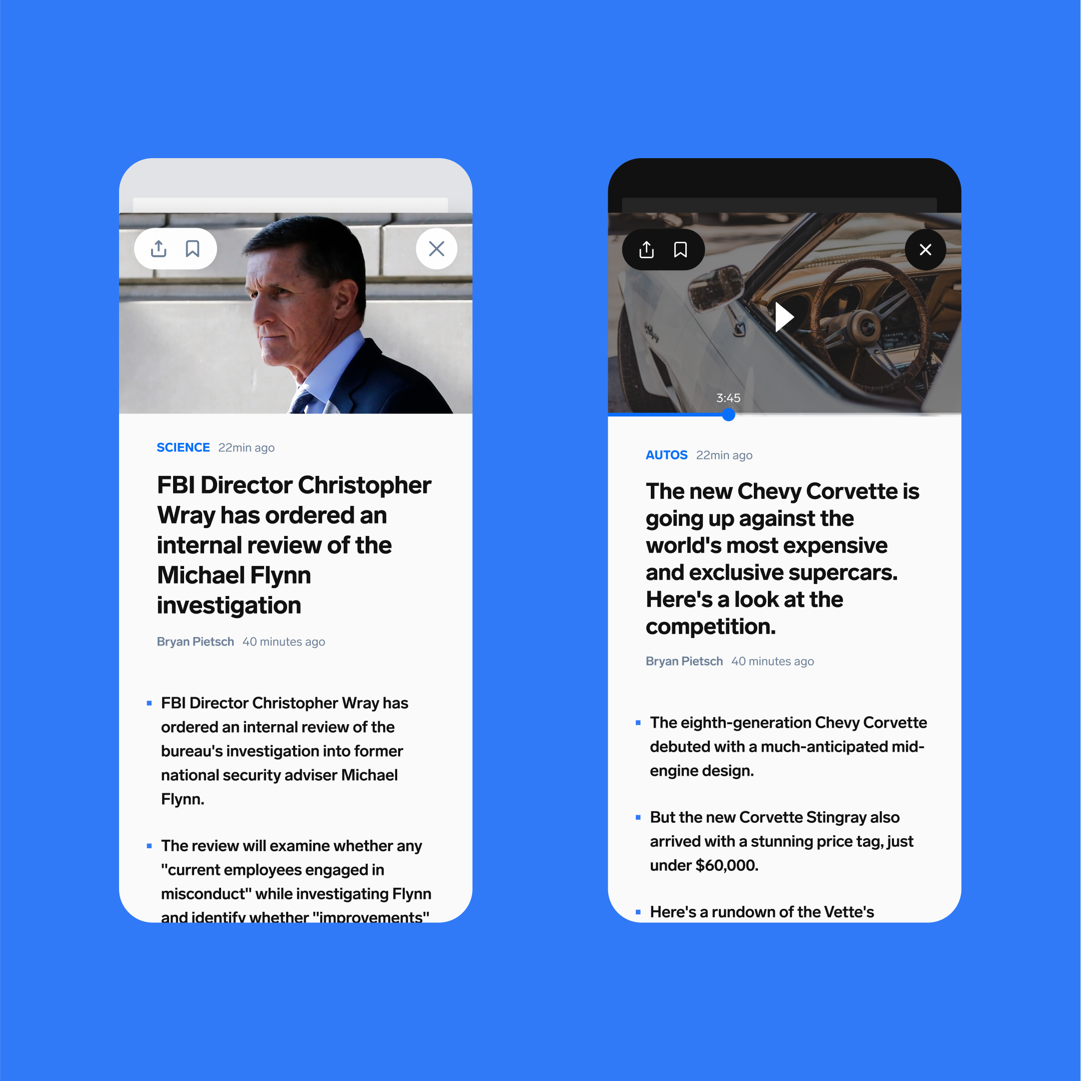
In our research, we discovered that many readers tend to click on articles but prefer to read only the bulleted summaries. To address this, we designed a unique browsing experience called Summary Mode that integrates these bullet points directly into the main feed.
Our research also showed that Insider subscribers preferred a single, randomized feed. This allowed them to stumble upon articles that they might not have otherwise found within their set preferences and once they tap on the headline, the article expands into view over top of the feed.
